Data visualization is an integral step in a data science process. At every step in a data science pipeline, data is visualized in one form or another. It is used to understand raw data in a process commonly known as exploratory data analysis, evaluating the accuracy of a model and providing results for easy interpretation. A good graphic design helps clarify meaning and ease communication. A powerful aesthetic also eases the visual navigation to mix the power of art and functionality.
Though R’s standard graphics package is strong for analyzing the data, it lacks essential aesthetic. The ggplot2 package has an entirely different approach to statistical plots. It is based on the book The Grammar of Graphics by Leland Wilkinson and was developed by Hadley Wickham. It follows a layered approach to give plots a better look with robust functionality.
The layered approach can be described as follows:
- Data layer: The dataset to be plotted.
- Aesthetics: Used to set data mappings and scales onto which we plot the data, i.e. what attribute goes on the X-axis and what goes on the Y-axis.
- Geometrics: Used to define visual elements and represents the overall look of the layer, i.e. a line graph, bar graph, point graph, etc.
- Statistics: An optional layer used to summarize data, i.e. binning or smoothing to draw regression lines.
Below is a quick method to plot data using ggplot2:
- The data is mapped to aesthetic attributes.
- A geom layer is then added to define the kind of plots we want to form.
- If we need some summary functions to be added to the graph, a statistics layer is appended.
Below is a simple example for illustrating a plot drawn using ggplot2:
library(ggplot2)
data(mtcars)
ggplot(data=mtcars, # Data
aes(x=disp,y=mpg,color=am))+ # Aesthetic
geom_point()+ # Geometry
stat_smooth(method="lm") # Statistics
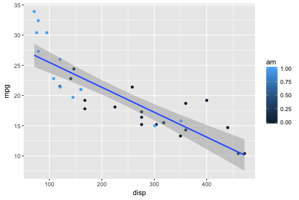
As we can see in the code, the main function ggplot defines the mapping between the data and plot axis. Next, different components are added into each layer to determine the type of graph and to add a regression line.
This is just a tidbit of what ggplot2 can offer. Below are some resources that can be handy for creating visualizations using this package:
