Nothing can be more exciting than examining where you stand on the leadership board in a competition. It becomes more fun when you think to use that data to do some study. Lately, Tableau, the market leaders in Data Visualization, has added direct connectors to Google Sheets in their new version Tableau 10. I thought to attempt this new feature to create some crisp visualizations quickly when I saw DZone December Writer’s Contest Leaderboard in Google Sheets.
To get started, download Tableau 10 desktop. Register for a 14 days free trial if you don’t have a license key. You can notice it has a lot more to offer than the previous version and the tagline is impressive — Your Data, Only Hotter.
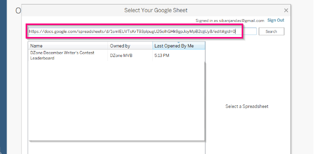
Enter your Google account credentials which open up a dialog box that presents all the sheets owned by you or shared with you. Alternatively, you can enter the Leaderboard sheet link in the search bar. Click Connect to import the spreadsheet to Tableau.
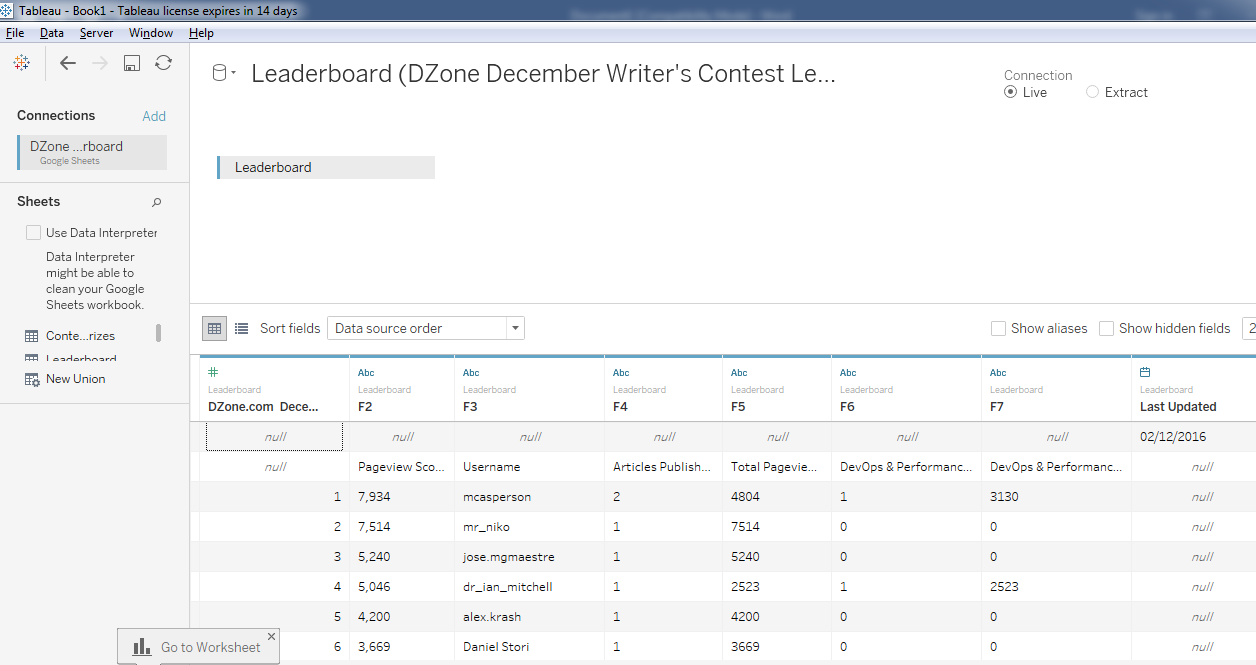
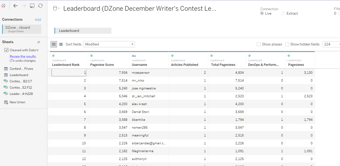
This opens up the Data Source Interface screen. You can view all the sheets of contest leadership board appearing on the “Sheets” section as shown in below figure.
We have chosen Connection as Live (Present at the right corner of the interface). It supports having a live connection with the sheet. Select Extract, if you want the data to be extracted and stored in a Tableau Data Extract(.tde). From the Sheets section, choose Leaderboard to inspect the data.
The data appears to be a bit dirty. The column names are not imported properly and are appearing in the actual data rows. Also, we have only a day’s data for doing the current analysis, so last updated field is not required. You can manually correct this errors or try out the Use Data Interpreter functionality to clean the sheet.
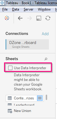
Using the Use Data Interpreter functionality, we have a better representation of the data with decent column names and last updated field removed which saved a lot of our manual work.
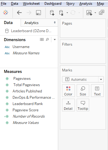
Navigate to Sheet 1 tab to create the Visualizations. The first things we notice here are the dimensions and measures. Dimensions are those objects which we want to track. Measures are the quantities that we want to measure. Though Tableau automatically categorizes the fields into different dimensions and measure, we can change this at our discretion. To know more about working around on this, you can read the Tableau Blog.
Drag and drop the Username field from Dimensions to the Rows shelf( Shown as Red arrow in the figure). Similarly, drag and drop the Pageview Score field from Measures to the Rows shelf( Shown as Pink arrow in the figure). Sort Username by descending by Pageview Score by clicking on the button shown in a red circle.
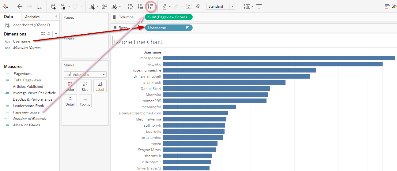
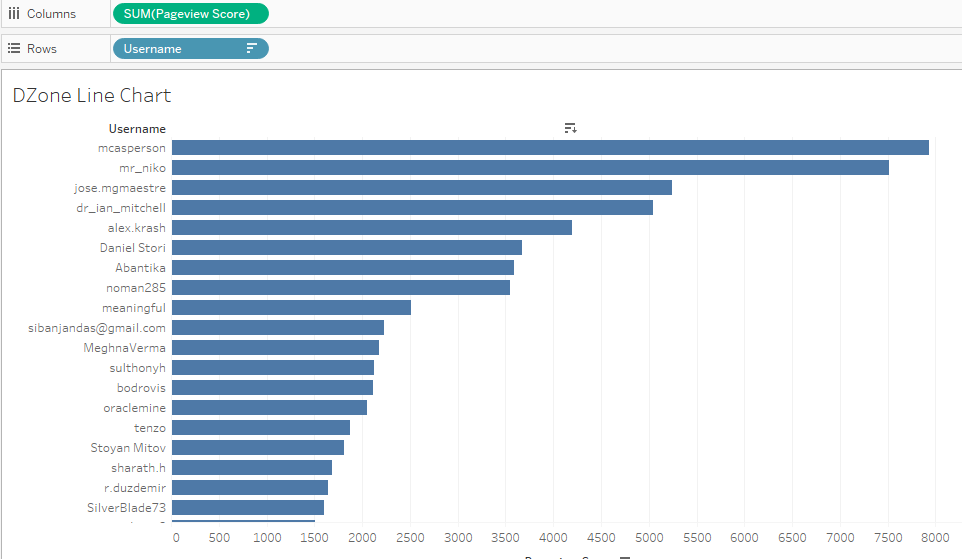
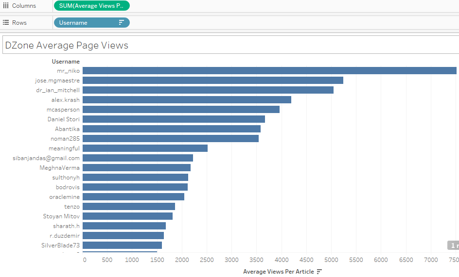
This creates a bar chart with Pageview Scores in X-axis and Username in X-axis. We can see the huge difference in pageview scores for the top two from the rest.
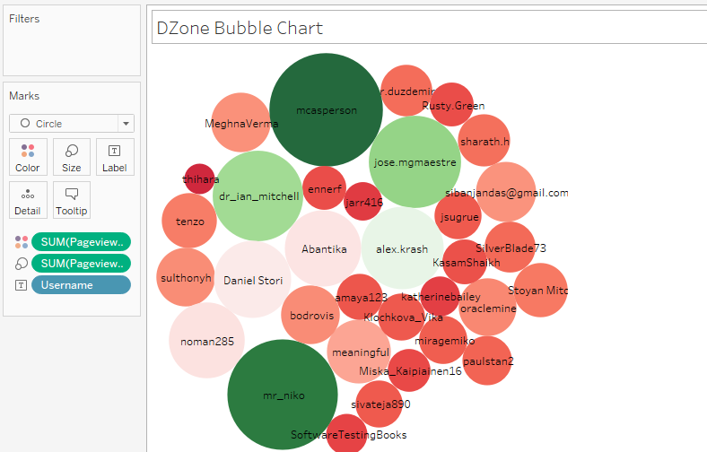
Similarly, try out different other visualizations such as a packed bubble chart.
You can also create some new attributes to engineer some more fields, for example, average page view per user. If we compare this with the previous line chart, we can watch some shuffle in the graph. mr_niko goes to the top and mcaperson gets down to 4th position. One can assume from this observation, the more columns we write will support us getting toward the top of leaderboard. So, let’s start writing more.
I am lucky to analyze the data using Tableau 10 and be positioned in Leaderboard at No 10. 🙂 Help me get some more elevation by liking and sharing this article.
The graphs I created is just a day after the competition (3rd December 2016). The entertainment will begin after a couple of days when we start seeing the shuffle in the leaderboard and perform cool visualization out of it.
