In the last piece, Fundamentals of Anomaly Detection, we discussed the different types of anomaly detection techniques. The rule-based anomaly detection techniques are very much tied up with the business rules and are primarily based on the experience of the business users. This article and the upcoming articles in this series will focus on using various machine learning techniques to identify anomalies.
In this piece, we use the exchange rates between the US and other countries’ datasets from Kaggle. The dataset provides the exchange rate movement of currencies from the year 1971 to 2017. This macro-level dataset can help identify when there is an abnormal trend in currency movements. Towards the end, we will validate our findings with the historical financial crisis events to verify whether our observation from the data holds.
For the below example and to validate the insights, we have used the exchange rate movements for pound, which is the United Kingdom’s (UK) currency. We have used the fundamental rolling mean absolute error (MAE) technique. There are other time series anomaly detection techniques like LSTM, which we will cover in future articles. You can pick up your currency or your preferred currency and try to get insights on when it crashed. In the next part of the series, we will use these insights to predict when the currency might hit again to prepare ourselves better.
As always, we start by loading the required libraries. The pandas and numpy libraries are the primary data manipulation libraries in Python. Package matplotlib is the most used and most comprehensive library that provides methods to plot data in Python. The command %matplotlib inline is directive and issued to the Jupyter notebook to display the inline plots and the cell where the plot is executed.
import pandas as pd
import numpy as np
from matplotlib import pyplot as plt
from sklearn.metrics import mean_absolute_error
%matplotlib inline
Next, we load the exchange_rates data. There were some text and other currencies in the original data file that were irrelevant for this study. I removed them prior to uploading it to a Pandas data frame. We create a time series plot for this data in the following code snippet.
data = pd.read_csv('timeseries\exchange_rates.csv', index_col=['time_period'], parse_dates=['time_period'])
plt.figure(figsize=(15, 7))
plt.plot(data.UK)
plt.title('Timeseries')
plt.grid(True)
plt.show()
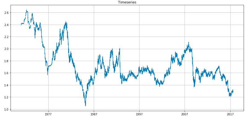
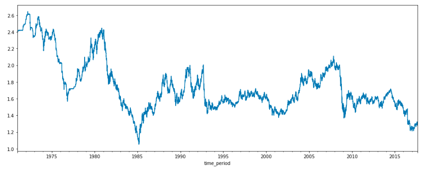
As we can see from the above plot, there are some missing values in between the series; we can do some data imputations to address the null values. We can use various methods to fill the gaps like rolling mean, rolling median, and various other interpolate methods. The pandas package has an interpolate function that can be used for this task.
data['UK'].interpolate(method='linear').plot(figsize = (16,6))
data_imputed =data['UK'].interpolate(method='linear')
data_imputed =pd.DataFrame(data_imputed)
In the following piece of code, we derive the anomalies and mark them in the time-series plot. The logic is outlined below:
- Window parameter is used to input the window size. The window size is required to calculate the moving average (also known as rolling mean). This is an important parameter for time series calculations as it defines how many previous values to consider for the calculations. When a window slides over each value iteratively, it is known as a sliding window.
- The mean absolute error (MAE) is calculated for each data point. The MAE is the absolute difference between the expected value, i.e. rolling mean and the actual value.
- Next, the confidence interval is estimated. The confidence interval is a range that is used to approximate the actual value of a number within this range.
- Any data value lying outside its confidence interval is designated as an anomaly and is marked in the plot.
def plotTimeSeries(series, window, scale=1.96):
rolling_mean = series.rolling(window=window).mean()
plt.figure(figsize=(15,5))
plt.title("Anomalies in the time series for \n window size = {}".format(window))
plt.plot(rolling_mean, "g", label="Rolling mean trend")
# Calculate confidence intervals based on MAE
mae = mean_absolute_error(series[window:], rolling_mean[window:])
deviation = np.std(series[window:] - rolling_mean[window:])
lower_band = rolling_mean - (mae + scale * deviation)
upper_band = rolling_mean + (mae + scale * deviation)
# Calculate Anomalies
anomalies = pd.DataFrame(index=series.index, columns=series.columns)
anomalies[series<lower_band] = series[series<lower_band]
anomalies[series>upper_band] = series[series>upper_band]
#Plot the confidence intervals and anomalies
plt.plot(upper_band, "r--", label="Upper Bond / Lower Bond")
plt.plot(lower_band, "r--")
plt.plot(anomalies, "ro", markersize=8)
plt.plot(series[window:], label="Actual values")
plt.legend(loc="upper left")
plt.grid(True)
We invoke the function plotTimeSeries with the data and 360 days as a sliding time window.
plotTimeSeries(data_imputed, 360)
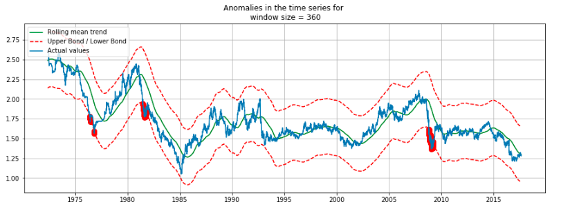
The anomalies — i.e. potential pound currency crash — are shown in red. The years around 1976, 1983, and 2008 are marked as anomalies. Now, if we go back to history and check the events for these years, we can see that there was a currency crash.
1976 IMF Crisis — A financial crisis in the United Kingdom in 1976
Early 1980s Recession — A severe global economic downturn that affected much of the developed world in the early 1980s
2008 Financial Crisis — Many economists consider it as the most severe economic crisis since the Great Depression of the 1930s
Though I knew about the 2008 financial crisis, I was ignorant of the other two before this analysis.
These insights from the data equipped me with specific facts and figures that I was unaware of, and this kind of analysis is termed as data-driven insights. I can utilize this information to dig more into these crises, or I might try to predict when the next financial crisis will occur.
In the next part of this series, we will see some more sophisticated methods for time series anomalies and predict the next currency crash. Until then, happy reading and data crunching for knowledge, insights, and fun.
You can find the code along with the data on my GitHub repo.
